Hey everyone, Catherine Grout here, Senior Colour Tutor at LCS and part of the Colour Team.
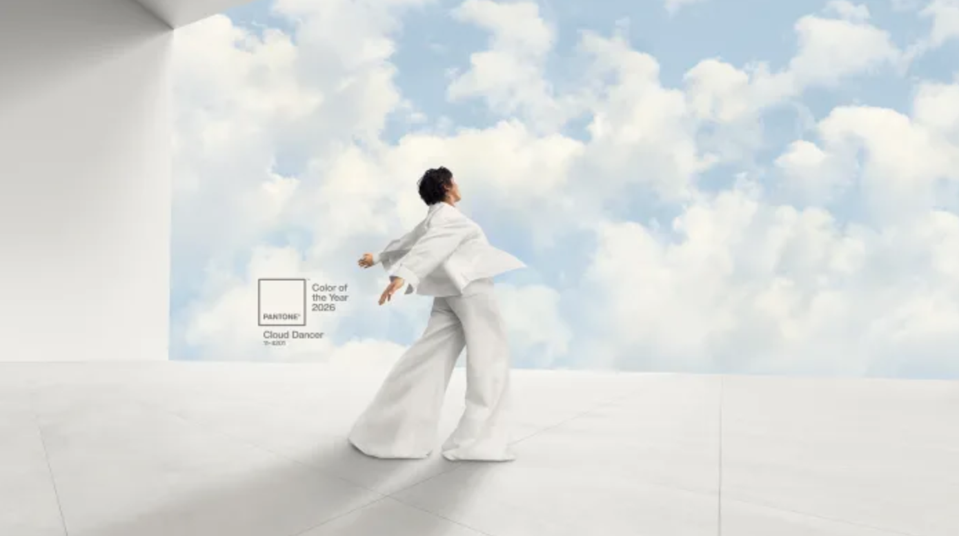
Today I’m really excited to chat with you about the brand new colour that’s just been released, Pantone’s 2026 Colour of the Year, Cloud Dancer (PANTONE 11-4201), and what it means for fashion, personal style, and the wider zeitgeist we’re all living in.
So… why Cloud Dancer, and why now?
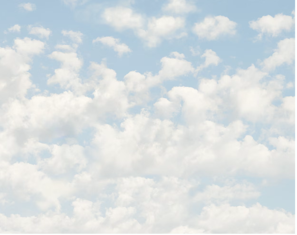
Cloud Dancer was officially announced by Pantone as the 2026 Colour of the Year earlier this month, in December 2025. What makes this announcement particularly interesting is that it’s the first time Pantone has ever chosen a shade of white as its Colour of the Year.
At first glance, white can feel like a non-colour, almost an opt-out. But I think it’s more accurate to see it as a reset. From a colour theory perspective, white isn’t the absence of colour at all. It’s the reflection of all colours, which makes it quietly inclusive rather than empty.
When you think about the past year, it’s not hard to see why this choice feels so relevant. Politically, economically and globally, 2025 has been a year filled with uncertainty, conflict and collective anxiety. There’s been a constant sense of noise, both literally and emotionally. And in that context, nothing speaks more clearly of pause, peace and recalibration than white.
Pantone describes Cloud Dancer as a “lofty white neutral whose aerated presence acts as a whisper of calm and peace in a noisy world.” That description really resonates. This choice reflects a deep longing for clarity, simplicity and calm, and a collective desire to step back from overstimulation, to reset, and to breathe.
And honestly, doesn’t that feel exactly right? With ongoing cost of living pressures, the relentless pace of change, and the constant barrage of social media and information overload, many of us are craving space and softness rather than more intensity.
According to Pantone, in a world full of distraction, Cloud Dancer offers a “blank canvas”, a reset button not just for design and fashion, but also for interiors and even our mental space. And if you look at what’s happening in fashion right now, you can really see this reflected. We’re seeing a growing shift toward brands that reconnect us with nature, craftsmanship and longevity, alongside sustainable and environmentally conscious labels gaining real momentum.
In other words, this isn’t just about the colour white. It’s about mood, mindset and the collective emotional climate we’re all navigating. The world seems to be asking for softness, space, clarity and elegance without noise.
“We’ve had enough of Colour Drenching!”
So, let’s take a deeper dive into what Cloud Dancer says about the zeitgeist right now?
When fashion, interiors, and design lean toward Cloud Dancer, it signals a shift. Here’s what I think we’re collectively reaching for.
Firstly, a need for calm and clarity. After years of hyper-connectivity, visual overload, rapid change, maybe even global uncertainty, people crave spaces (physical and mental) that are peaceful, quiet and clean. Cloud Dancer channels that desire.
Minimalism and mindful living is also needed right now. It’s a sign that the pendulum is swinging away from loud trends, excess, and over-saturation. Have we finally had enough of ‘colour drenching’ fashion looks and interiors? So, I think this signals a swing toward thoughtful design, simplicity, timelessness, and intentionality.
Think of sitting down for a moment with white sheet of paper at a desk. What’s the feeling here. It’s blank-slate thinking! Like a clean sheet of paper, Cloud Dancer gives designers, stylists, creatives and individuals the space to imagine, to build, to reimagine without being tied to yesterday’s palette.
Whether in fashion, interiors or lifestyle, Cloud Daner suggests people want to start fresh, a reset. It’s about renewal and quiet confidence and a move away from loud proclamations in your approach to creative business. Haven’t we had enough of jumping around on socials and trying to make a loud noise? I mean, of course, we all LOVE colour. And there’s no need to hide that right? But, the approach of today needs calls for something more sedate, mindful, and introspective.
So, I think we should see Cloud Dancer as the perfect “soft reset” colour for 2026, for wardrobes, personal style journeys, interior schemes, branding, moodboards, and creative experiments.
Cloud Dancer & Personal Colour Analysis: Who Does It Suit?
You know I teach seasonal colour analysis at LCS, and how much nuance matters when choosing tones that flatter. Cloud Dancer has some interesting implications depending on your season.
Warm Vs. Cool: Cloud Dancer as a “Neutral Neutral”
Cloud Dancer is described as a beautifully balanced white. It is not harsh, not clinical, but soft, airy and luminous, sitting gently between warm and cool. That is exactly why it feels so versatile. It can act as a neutral canvas against which many palettes may work, rather than forcing the colour conversation in one clear direction.
As a true “neutral neutral”, Cloud Dancer does not impose warmth or coolness strongly. Because of that, how it behaves on you will depend on your undertone, contrast level and overall colouring. In practice, this means it often needs support. The right accompanying colours, metals, textures or accessories will tip it either warmer or cooler and help it sit more harmoniously with your natural palette.
That said, we can expect to see a wider range of white shades entering store assortments alongside Cloud Dancer. Warmer creamy whites, cooler bluish whites and brighter optic tones will all appear as variations on this theme. This is where colour analysis becomes especially important.
For colour types that thrive on strong contrast or clarity, hello Winters, Cloud Dancer can work, but cooler and crisper white variants will often look even better. Bluish whites and icy tones tend to enhance Winter colouring, and also suit Summer palettes beautifully, where softness and coolness are key.
For Spring and Autumn clients, particularly those with warm or muted colouring, cooler bluish whites can be very unflattering. They often drain warmth from the skin and create a washed out effect. Warmer white variants, with cream, ivory or soft golden undertones, are generally far more flattering for these palettes, even if Cloud Dancer itself sits somewhere in the middle.
This is what makes Cloud Dancer interesting rather than prescriptive. It is designed to sit between warm and cool, which gives it flexibility, but it also means it is not a one size fits all solution. Like any neutral, it needs context. It needs thoughtful pairing. It needs styling intention.
What are you thoughts?
I’m genuinely excited by Cloud Dancer. It feels like a thoughtful, courageous choice from Pantone. White might seem “safe” or even “nothing,” but when it’s done well, when it’s soft, balanced, considered, white becomes possibility. A blank page that invites creativity, calm, and new vision.
If you’re interested in learning more about colour, stay tuned for future blog updates by joining the LCS newsletter. You can subscribe via the home page, and there’s always the opportunity to join me and the team on our colour courses, with the next colour analysis programmes starting in February 2026.
Click HERE for more details.